

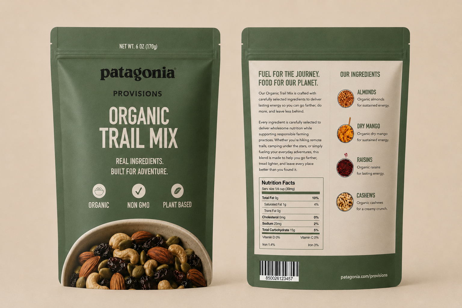
Patagonia Provisions — Organic Trail Mix
Packaging System
Project Overview
Patagonia Provisions Organic Trail Mix is a conceptual packaging and campaign system designed for environmentally conscious consumers who value nutrition, outdoor exploration, and responsible production.
The project transforms a single trail mix product into a coordinated consumer experience that includes primary packaging, supporting product labels, a hang tag, a bi-fold product guide, and a full-page print advertisement. Each component communicates the product’s benefits while reinforcing a cohesive story centered on organic ingredients, adventure, and environmental responsibility.
Project Type: Packaging & Campaign Design
Role: Visual Designer
Deliverables: Product Packaging, Product Label, Hang Tag, Bi-Fold Guide, Print Advertisement
Tools: Adobe Illustrator, Adobe InDesign, Adobe Photoshop
Format: Print-ready CMYK system
The primary packaging and print advertisement establish a coordinated visual direction across product and campaign applications.
The flat artwork below presents the final front and back packaging panels alongside the full-page print advertisement before showing each design in context throughout the case study.
Packaging Design · Campaign Design · Sustainable Brand Communication
Packaging & Campaign Direction
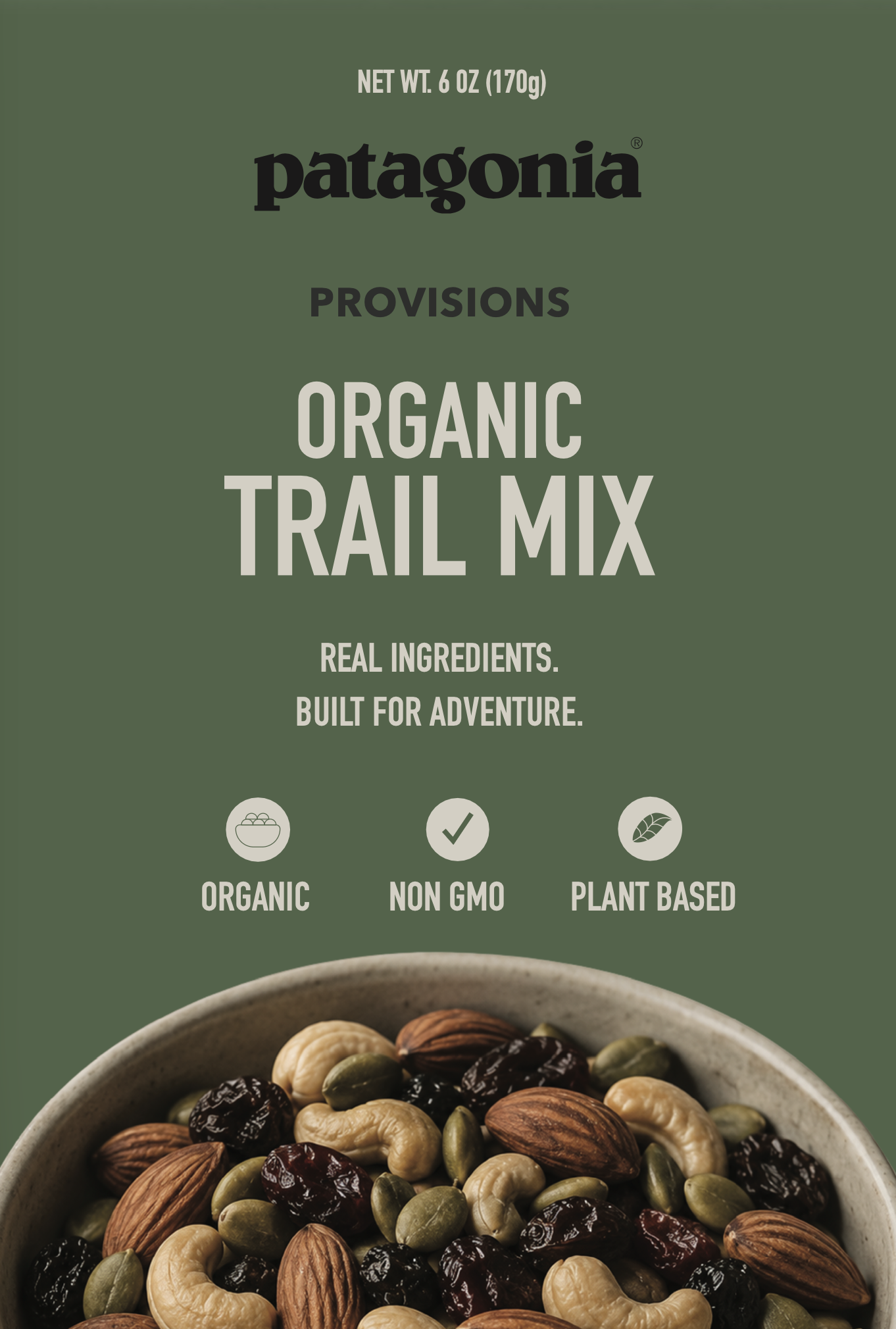
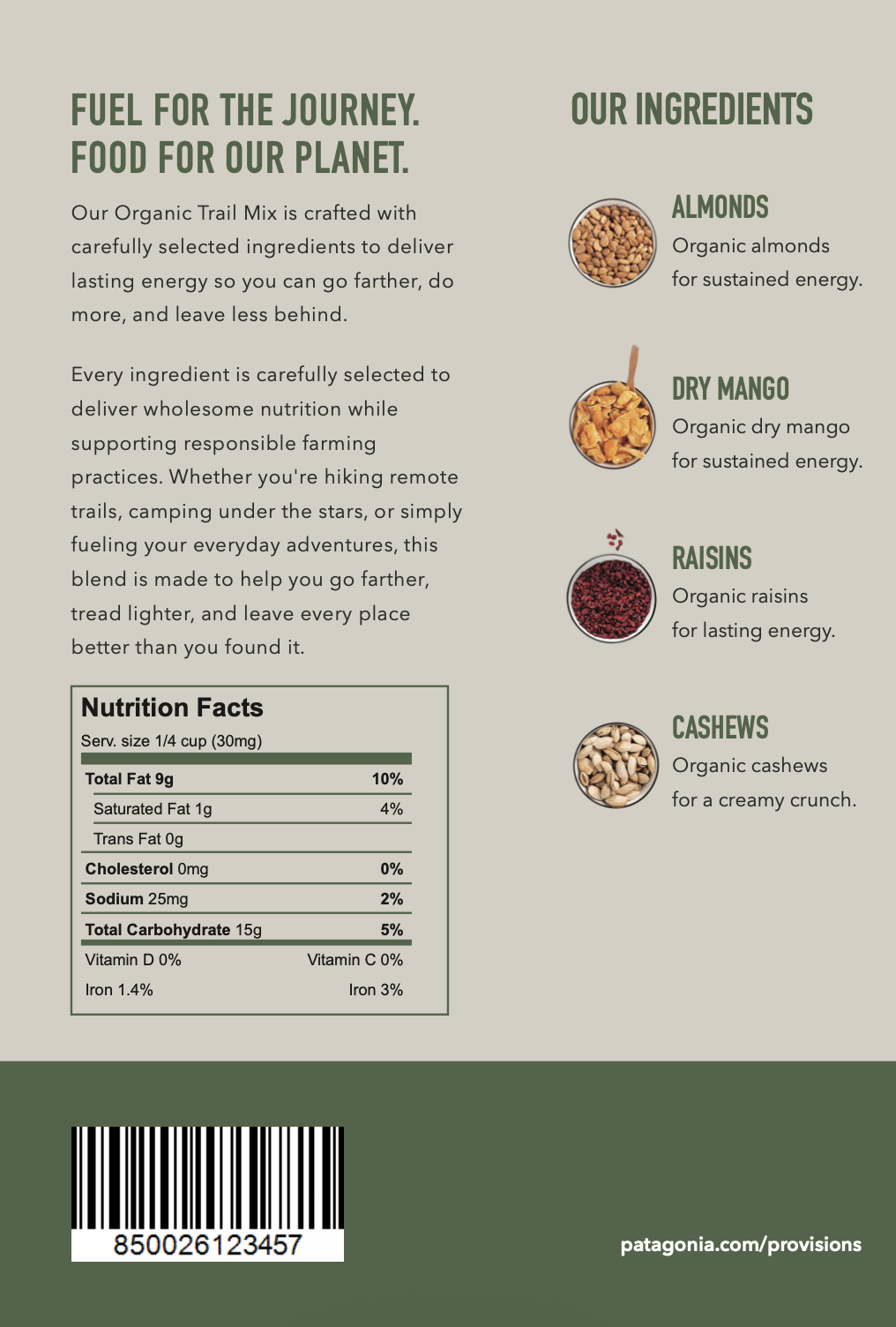
Primary packaging system — front and back panels.
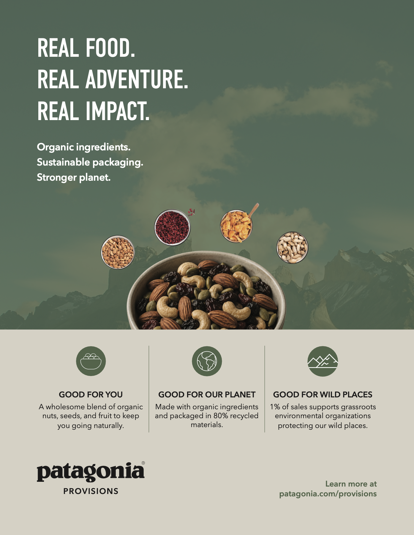
Full-page campaign advertisement.
The Challenge
The challenge was to create an outdoor food packaging system that felt consistent with Patagonia’s established visual identity while giving the product a distinctive and recognizable presence.
The objective was to develop a coordinated system that:
Established clear product recognition
Organized detailed product information effectively
Connected food with outdoor exploration
Communicated organic and plant-based positioning
Maintained consistency across packaging, editorial, and advertising formats
My Approach
I developed a modular design system grounded in functionality, natural color, and clear information hierarchy.
Key contributions included:
Establishing the packaging’s visual direction
Designing the primary front and back panels
Organizing product, ingredient, and nutritional information
Creating supporting icons and mountain graphics
Extending the system across labels, a hang tag, a bi-fold guide, and advertising
Preparing coordinated print-ready files
The central positioning statement, “Fuel for the journey. Food for our planet,” guided the messaging and connected the product’s functional benefits with its environmental narrative.
Packaging System
The primary package establishes the visual foundation of the system through an earthy green field, oversized product typography, and close-up ingredient photography.
The front panel prioritizes product recognition, net weight, and key product attributes. The reverse panel uses a structured layout to organize the product story, ingredients, nutritional information, and digital touchpoint.
Supporting product labels and hang tags extend the same typography, colors, and mountain imagery into smaller applications, creating a flexible and recognizable packaging family.
Bi-Fold Product Guide
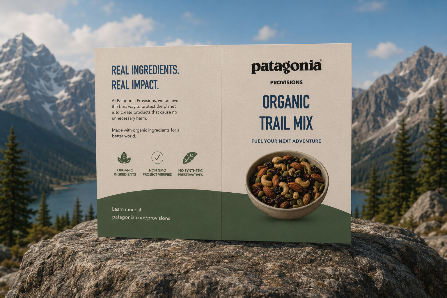
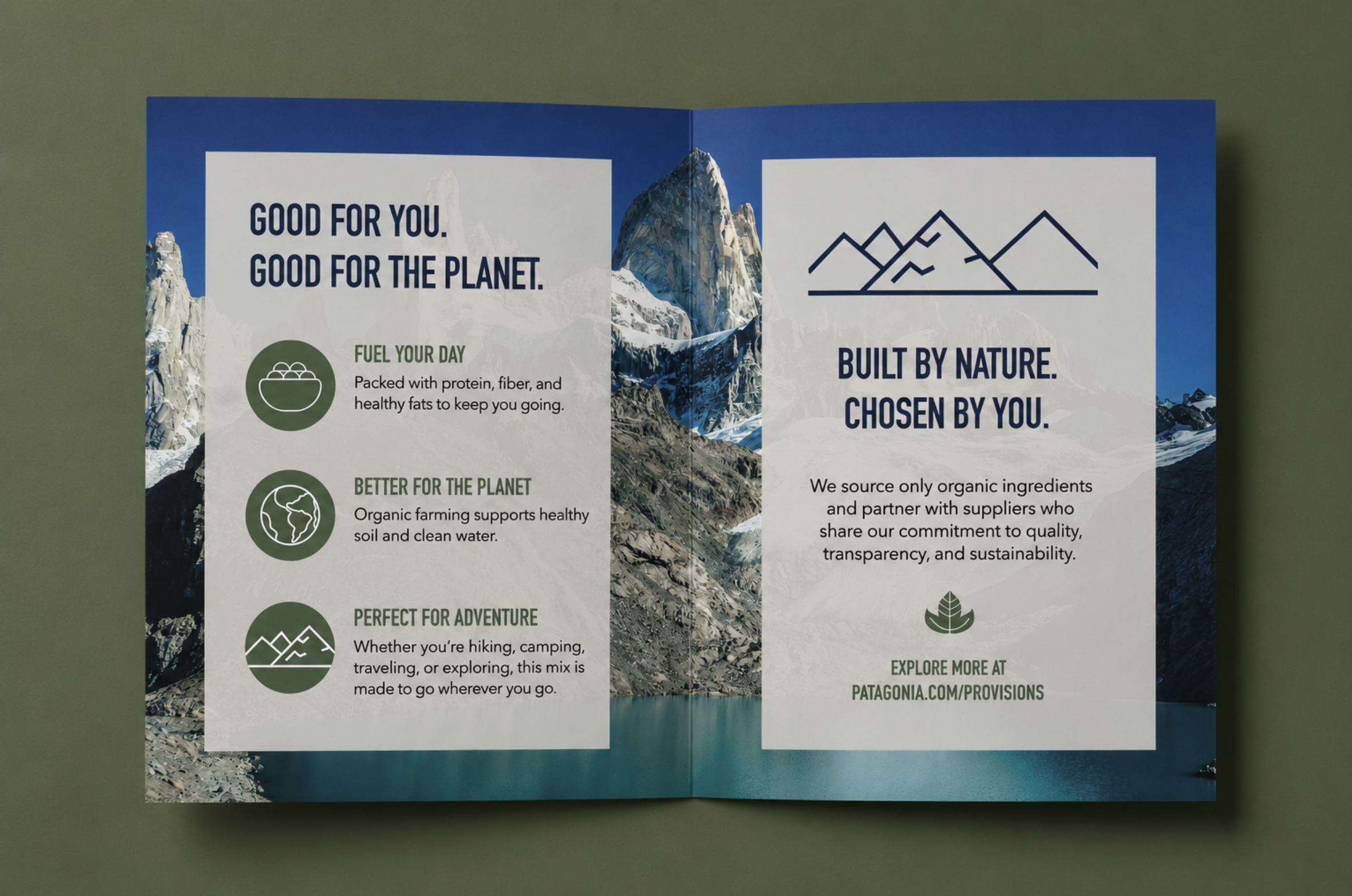
The bi-fold guide expands the product story beyond the limited space available on the packaging.
The exterior introduces the product through the message “Real Ingredients. Real Impact.” Inside, nutritional benefits, outdoor use, and environmental responsibility are organized through custom icons, concise messaging, and a mountain landscape.
Designed as a retail or in-package companion, the guide provides additional product context while maintaining visual continuity with the primary packaging.
Print Campaign
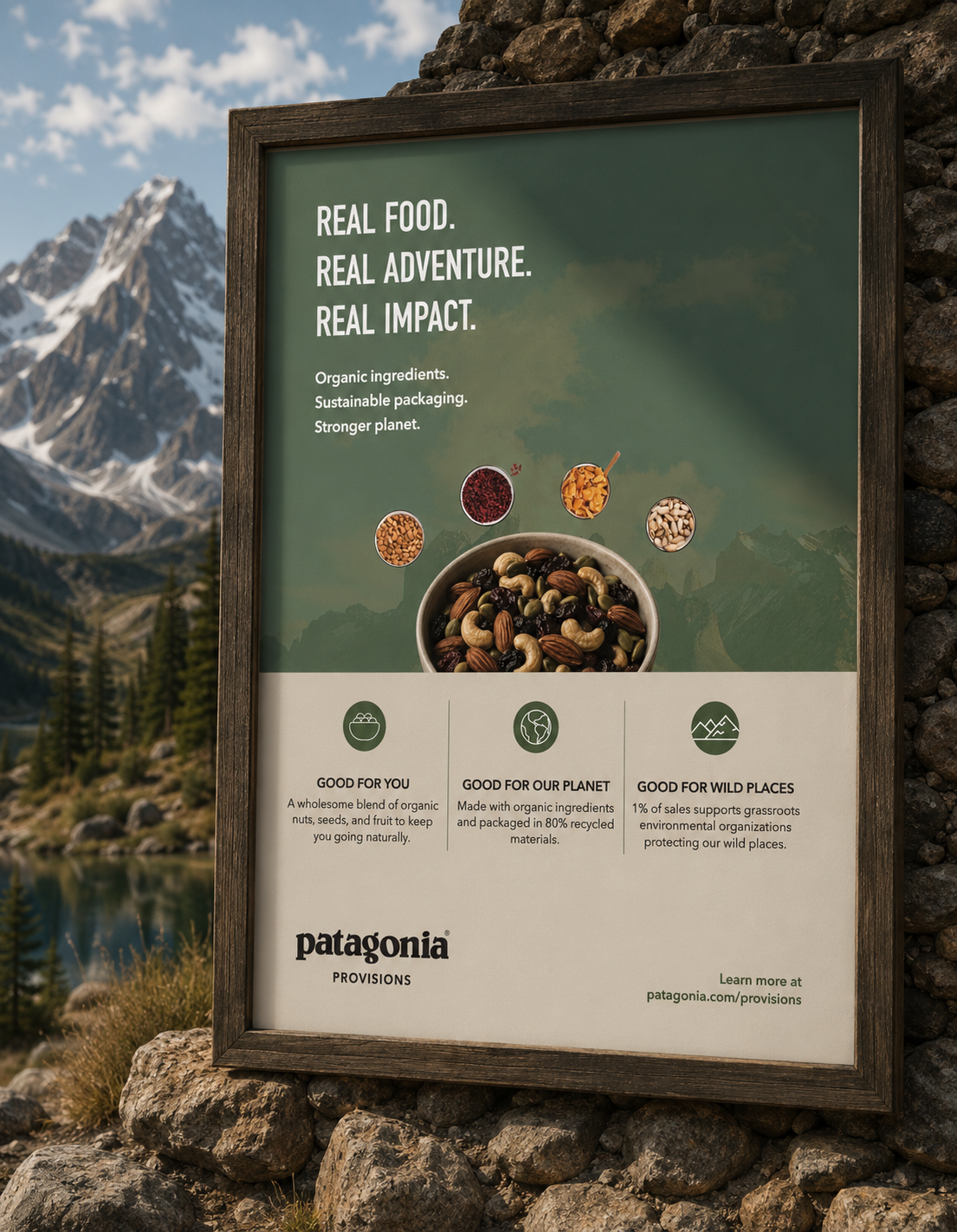
The full-page advertisement translates the packaging system into a broader campaign message:
Real food. Real adventure. Real impact.
Product photography, outdoor imagery, and three concise benefit areas communicate the concept quickly while preserving the colors, typography, and visual hierarchy established across the packaging system.
Product Labels
The front and back product labels extend the packaging system into a compact, custom die-cut format.
The front label prioritizes product recognition through the Patagonia Provisions identity, condensed typography, and mountain silhouette. The reverse label organizes ingredient and nutritional information within the same restrained palette and visual hierarchy.
Together, the two-sided label demonstrates how the system adapts to a smaller format while maintaining clarity, consistency, and brand recognition.
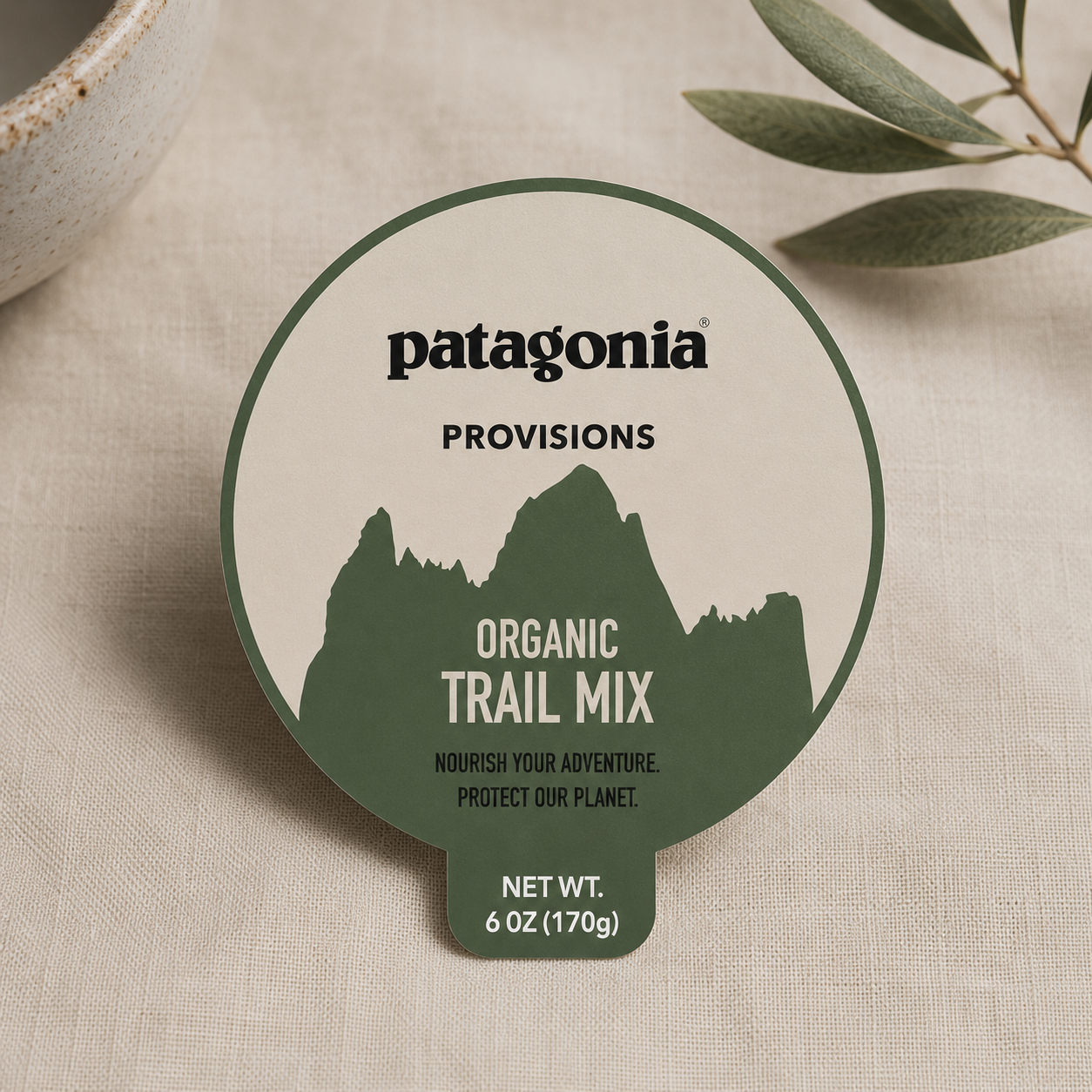
Front product label focused on product recognition and shelf presence.
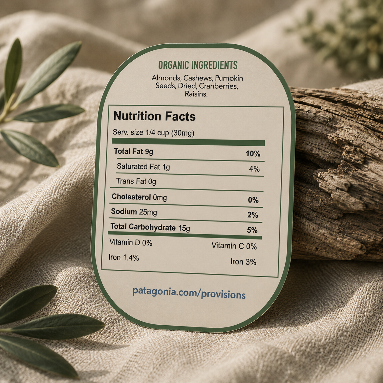
Back product label organizing ingredients and nutritional information.
Product Hang Tag
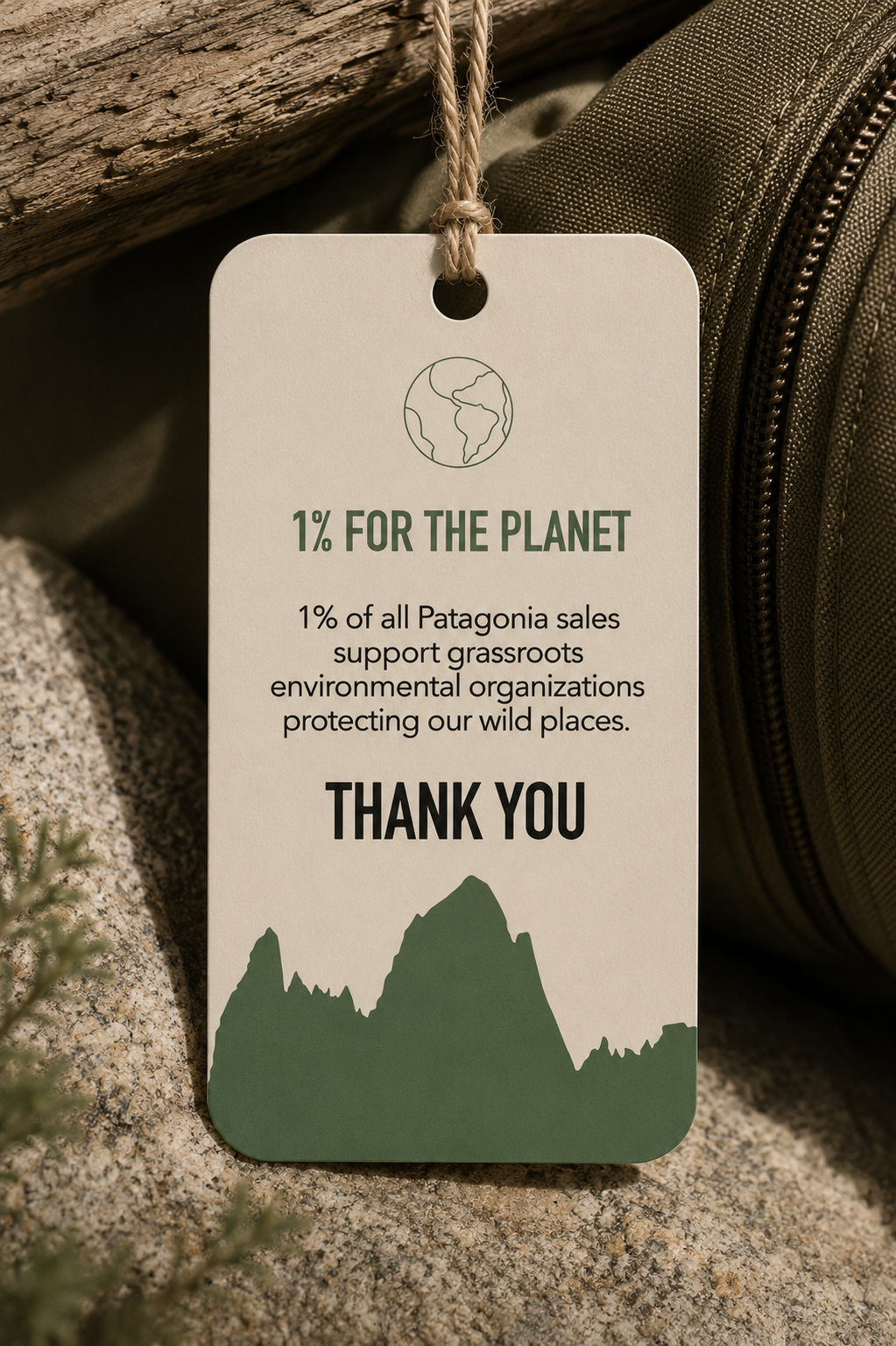
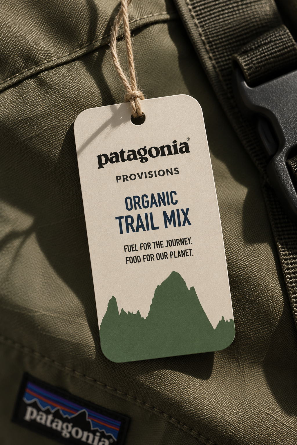
The two-sided hang tag extends the packaging story through a compact brand touchpoint that combines product identification with environmental messaging.
Front hang tag featuring the product identity and mountain graphic.
Reverse hang tag highlighting the environmental message.
Design System
To maintain consistency across every application, I developed:
A restrained, nature-inspired color palette
Condensed display typography paired with a readable sans-serif
Custom supporting icons and graphic elements
Mountain silhouettes and outdoor imagery
A consistent product-information hierarchy
Coordinated messaging across packaging and campaign materials
This modular system allows each component to function independently while remaining recognizable as part of the same product family.
Final Deliverables
Primary trail mix package
Front and back product panels
Product label
Product hang tag
Bi-fold product guide
Full-page print advertisement
Custom icons and supporting graphics
Print-ready CMYK files
Outcome
The final direction transforms a single trail mix concept into a cohesive consumer experience spanning packaging, product education, and advertising.
The system balances strong product recognition with detailed information and environmental storytelling. Its modular visual language could be extended across additional flavors, package sizes, retail displays, and future campaign applications.
Independent branding concept. Patagonia® and Patagonia Provisions® are trademarks of Patagonia, Inc.